I’m an iPhone user at heart, but as an interaction designer at CollegeMobile, my job requires me to design for all the major mobile platforms: iOS, Android, BlackBerry, and Windows Phone. There is no better way to learn a platform than to use it as your actual phone, so I’ve been using different devices (notably iPhone 4S and Galaxy S3) as my primary device to understand the different platforms.
Last weekend, I got a BB10 phone (the Z10), and I must say that BB10 is a great platform. The more I used it, the more I liked the way the interface is set up. Here are my three favourite interface concepts from BB10.
Back button
On iOS, the “back” button is always in the top left corner. I am right-handed, and other than while typing, I almost exclusively use my phone one-handed. This makes the back button placement on the iPhone the farthest possible from my comfortable resting position. On Android, I had a different problem. I usually rest my thumbs on the bezel on the bottom of the device, and would often tap the S3’s soft back button accidentally.
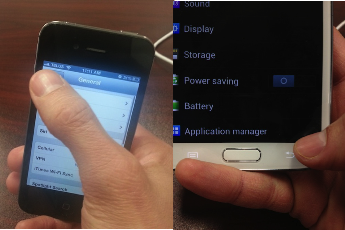
Reaching for the iPhone back button/Resting my thumb on S3 back button
On BB10, the back button behaves similar to the iPhone. The back button appears when you navigate to a screen in a hierarchy that makes sense to go “back”; however, it appears at the bottom left (and is quite large), making it far easier to tap when needed, but not easy to tap accidentally.
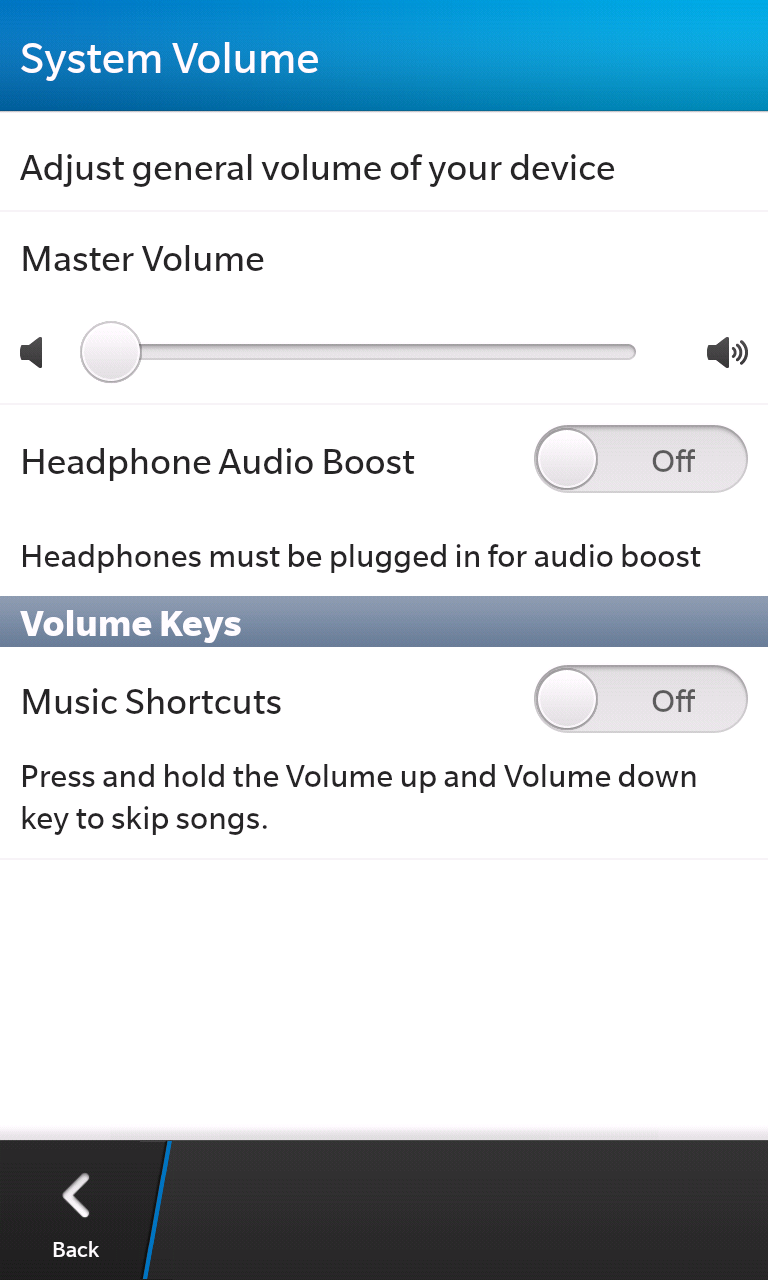 BB10 Settings app
Pull down menu
I’ve always liked having a dedicated “menu”. When designing for iOS, I never know where to put the global settings (for example, default choices for units of measurement or locations), and screen-specific options (for example, clear all). These usually end up as buttons in the navigation bar along the top of the screen; however, on iPhone, you only have room for one or two buttons (remember the back button is at the top left). Android has solved this problem with the action bar, which puts main actions at the top right and has an “overflow” of buttons along the bottom of the screen. The action bar isn’t actually supposed to be used for settings, though, as the name suggests (“action” bar).
In BB10, when you pull down from the top of the screen, there’s a menu hidden up there. This is a great place to stick both global and per-screen settings. It also doesn’t take up any screen real estate until you need it.
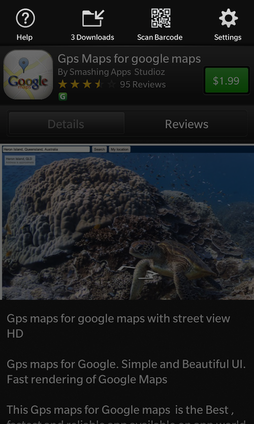
BlackBerry World app
Expanding screen drop down
On the web, drop down lists are very common. They are great because they show which option is currently selected, allows you to change the option in-place (without going to another screen), and uses minimal screen real estate because it hides unselected options.
In the mobile worlds, Android has drop down lists that work pretty similarly to the web; however, because of limited screen space, sometimes these work strangely when you open one near the bottom of the screen. They also cover up the text below them, which may make it hard to get context of where you are on a page. On iOS, the problem is much worse, because there is no concept of a drop down list. The equivalent is a modal dialog, which comes up from the bottom and covers the whole screen, or a new screen that comes in from the right with a back button at the top left. These animations take a long time, and it really feels like overkill when you are just switching between 3-4 options.
I love how BB10 has solved this. There is a drop down list of sorts, but it doesn’t cover up items below, because it moves everything down. Not only does this bring this very useful interface concept into mobile, they are fast and lightweight, and they look great!
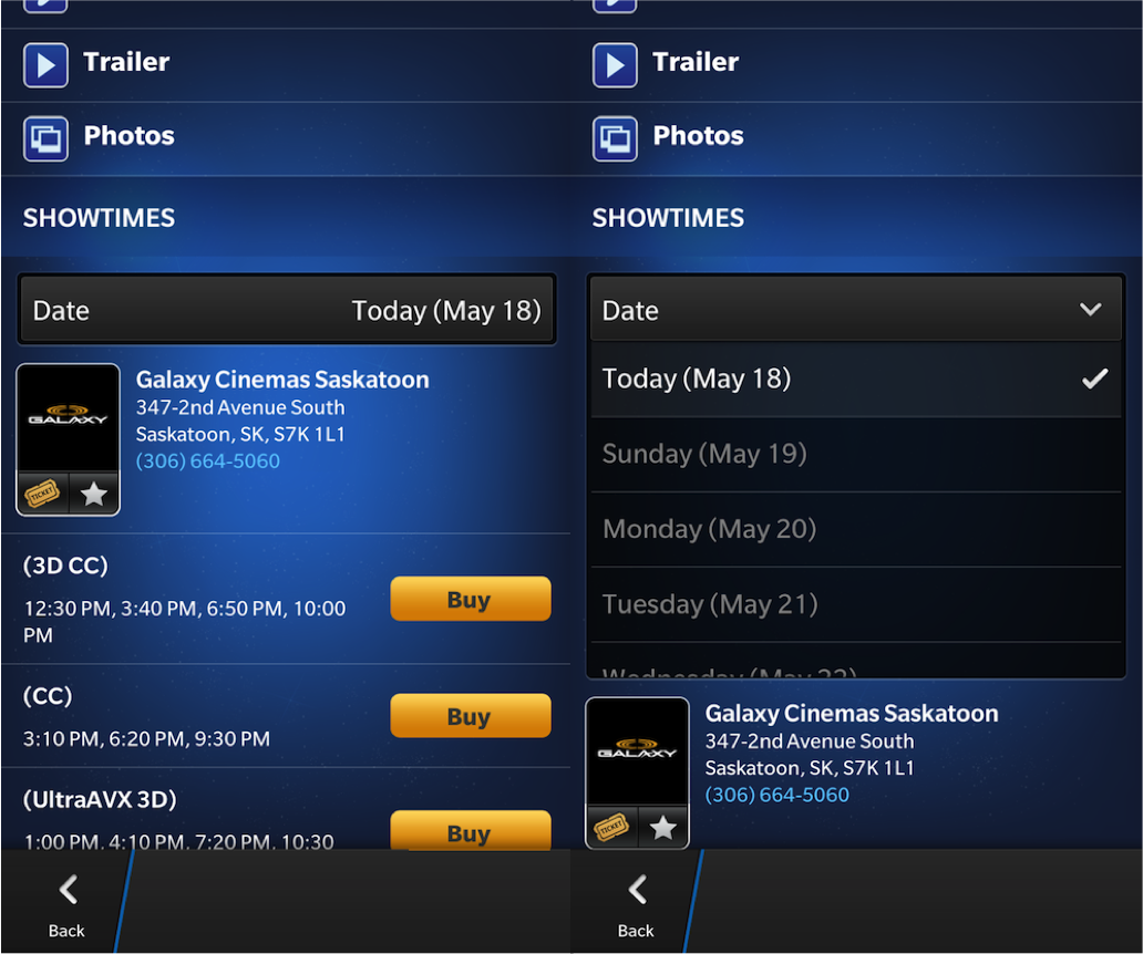
Cineplex app
Conclusion
Overall, I loved using BB10, even for the short while I had with it. What I like the most about BB10 is that it feels unique: it feels like it is something novel, not a copy of another platform. It has its own interface concepts that work well and look great. I’m excited to start designing and building awesome apps for BB10!