
There are many things to consider when you’re planning to release an application for multiple platforms. Many brands get some these things wrong; they miss out on building the best experience for each platform. I’d like to outline some of the major pitfalls made by some brands.
Applications Icons
You may wish to use the same icon across all mobile platforms — this is not the best solution. You should check each company’s icon design guidelines before making a choice. The guidelines can be found here: Android, BlackBerry, iOS, and Windows Phone.
You can use a very similar icon for each platform, but you should consider the differences between each platform. In iOS 6, for instance, icons often have lighting applied to them from the top. In BlackBerry 10, light applied to the icon should be coming in from the top left at a 90 degree angle. Windows Phone icons are flat, and should have no shadow effect applied to them. Android icons are supposed to be designed with 3 dimensional depth, as if you were viewing the icon from slightly above and in front of it.
Icons often stand out, when they do not match the platform design guidelines. The simple changes that need to be made to make an icon fit perfectly into each operating system are well worth the investment.
The “Share this App” Paradigm
Many applications like to offer the user a way to share the application with friends. There are lots of different services that you can share with, and each platform handles sharing in different ways.
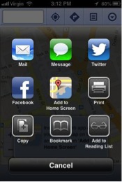
In iOS it is common to present a menu from the bottom of the application listing the applications you are allowed to share with.
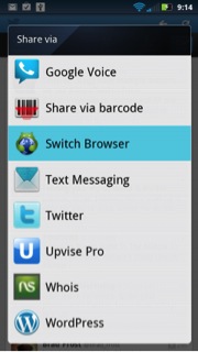
In Android, when you want to share an application, it is common to use the default “invocation framework” to present the list of applications that it is possible to share with.
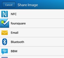
In BlackBerry there is a dedicated share icon that should always be used when sharing to another application[1]. This icon should present the default share list, provided by the OS, for the user to share with.
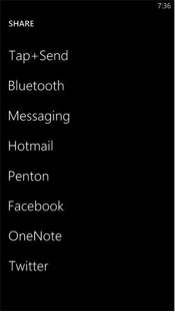
In Windows Phone a list of text labels is shown.
When designing what your “share” button and popup menu should look like, it is important to consider what the default for the operating system is, and what your motivation is for doing it differently. By not following the guideline, you are introducing a confusing interface to your user. They are not expecting to see your unique interface, and it will jar them out of the great experience you’re hoping they will have, while using your application.
The Back Button
This is a simple and clear cut guideline, but it is not always obvious to someone who has not used each different smartphone platform.
In Windows Phone and Android, your application should almost never present a back button. There is always guaranteed to be a back button provided by either the hardware or operating system, meaning an additional back button would be redundant and constitute bad design.
In BlackBerry 10, the back button is built into the default navigation interface; it is presented in the bottom-left corner of the screen, whenever it is necessary. In iOS, like BlackBerry 10, the navigation interface provides the back button for developers. However, in iOS, the back button is presented in the top-left corner of the screen.
Placing a back button anywhere that is not built into the navigation interface in BlackBerry 10 or iOS, or anywhere at all on Android or Windows Phone, should be done extremely sparingly and with great consideration.
You should consider that users of these platforms are completely in tune with their own OS paradigms and will find it jarring if an unnecessary back button is included. Including a back button in Android is just as confusing as not including a back button in iOS. It completely breaks the OS’s paradigm and will destroy the user’s application experience, jarring them back into reality and forcing them to learn an unintuitive action.
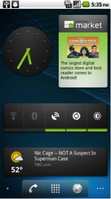
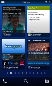
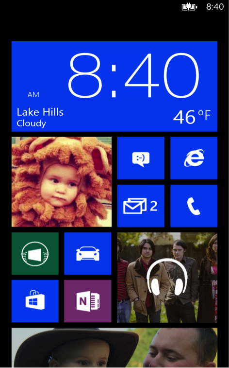
Widgets, Active Frames, and Live Tiles
Android, BlackBerry 10, and Windows Phone each offer their own form of widget, or window into the application while it is not running. Making use of these can vastly improve your user’s application experience, and will set your app apart from others. These components must be built specifically for each operating system, but they offer great benefit.
In Android, a widget can be placed on one of the operating system’s home screens. Android gives developers great amounts of control over how their widget can look and feel, how big it can be, and what the purpose of it is. Applications can even define multiple different widgets of varying sizes, if they’d like. These widgets will automatically run every time the operating system is booted, once they’ve been placed onto a home screen.
In BlackBerry 10 there is something called an “Active Frame”. When an application is moved into the background, a window — one quarter of the size of the screen — shows a minimized version of the last screen that was opened in the application. Developers can modify this active frame to display whatever they’d like, however. For instance, a weather app would likely want to show a summarized version of the weather. This way, a user wouldn’t need to open the application, unless they wanted to see weather details. The size of this active frame will always be one quarter of the size of the screen, and the active frame will only appear if the user opens your application, then moves it into the background.
In Windows Phone, the concept of a window into the application is called a “Live Tile”. A live tile is like a bigger version of the application icon that can be a number of preset sizes (the user decides what size they want your tile to be). Optionally, the user is not required to have a live tile of your application at all, but it provides a quick shortcut to your application and will likely be used by the user if they are an avid user of your application. Live tiles can present whatever types of data they like, but are most often used for showing the number of alerts in the application or some summarized application data.
I hope this look into some of the common pitfalls that can be encountered while considering cross platform applications will help you design the perfect application experience for each operating system. Application users are very demanding in this day and age, and will drop an application within seconds if they feel it hasn’t been tailored perfectly to them. By spending a little extra effort to get the small details correct, on each platform, you can greatly increase your user satisfaction, and assure yourself a very important good first impression.
CollegeMobile has dedicated Interaction Designers that can ensure your app is designed perfectly for each platform. Contact us to find out how we can create the perfect app for your company. 1-800-298-7081