Carleton University has had a mobile presence for many years. In fact, they were at the forefront of providing students with a solid, simple app to improve their university experience. In keeping with that spirit, Carleton decided it was time to refresh their app for a new school season.
Redesign with new features
They decided to go full out and completely re-skin the application, as well as add some exciting new features for students. Along with previous features like viewing classes, exams, and grades, they added a new Student Accounts feature where students can quickly check their outstanding balance and ensure they stay on top of their payments. Along with CULearn – their innovative Learning Management System – this completed a trifecta of online information Carleton provides to its students.
Single Sign In
One issue that arose in offering all of these services, is that they are all unique and separate systems. This meant that users would have to log in to each of the three sections separately. As Carleton prioritizes their students first, they set out to solve this problem.
In conjunction with CollegeMobile, they rolled out a Single Sign In system, which allows users to log in once to access these three valuable systems. This reduces friction and frustration for their users, and ensures students can quickly access the information they need.
Content Focus
When iOS apps first became popular, an icon grid was often utilized as the main screen of an app. These icons represented each piece of functionality an app offered. It was very similar to how iOS still currently uses a grid of icons for their home screen. The only problem with using this grid in an app is that it presents the users with an array of choices, and no logical grouping between these choices.
In their redesign, Carleton went with a tabbed approach. This allowed logical grouping to the app’s features, as well as opening up space to have featured content immediately displayed to users. Carleton wants students to be up to speed on all campus information, especially important information such as registration deadlines.
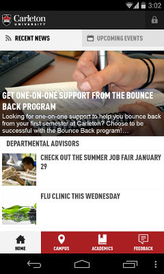
This drove them to bring users immediately to Recent News, which is featured immediately on launch. Upcoming Events are then a single tap away. Utilizing a stylish feature graphic for the most prominent news item was a great way to ensure users didn’t miss any crucial news items.
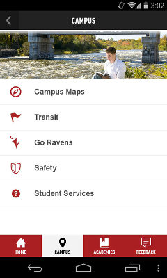
Following that is Campus which contains anything a student needs to know about campus life and activities, including transit service details. A small amount of parallax scrolling was added to the rotating feature graphics to ensure the app feels lively, even when it’s presenting static information.
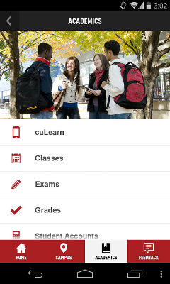
Academics follows next, which allows user to access the previously mentioned cuLearn, Classes/Exams/Grades, and Student Accounts features. Via the app, students can easily add their classes to their devices calendar, to ensure they’re never late to class again!
Finally, because Carleton is always looking to improve, they have prominently featured a feedback section where students can ask for support, suggest features or congratulate Carleton on their amazing app!
With a fresh design and new features, Carleton is again raising the bar for student-focused mobile apps! If you’re a Carleton university student, or just want to try out the app, you can download it from the Google Play Store or from the iOS App Store. If you’d like to learn more about Carleton University, visit their website.