
When developing a heavily UI based iOS application, using auto layout can be quite the love-hate relationship, especially when dealing with the scroll view. Simple layout designs can be quite tricky to implement with one prominent example being implementing a grid-like pattern of arbitrary row and column sizes. Fret not, however, for this tutorial will walk you through creating a simple grid pattern.
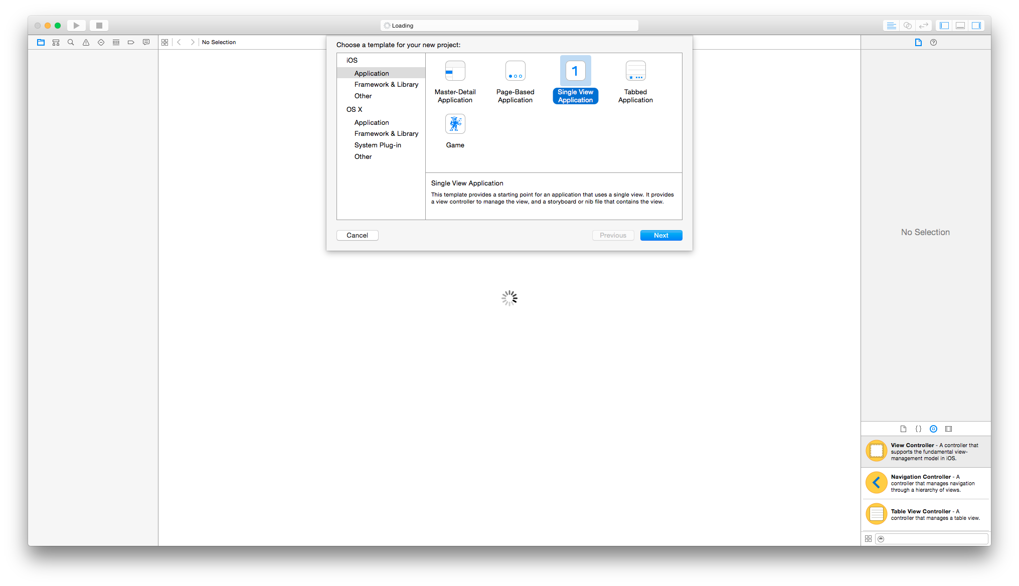
To start, open up Xcode and create a new Single View Application project.
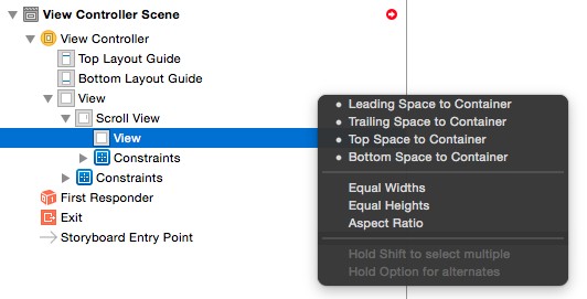
Now add the scroll view as a child to the view controller’s root view and apply the standard constraints to fit onto the screen (top, bottom, left and right).
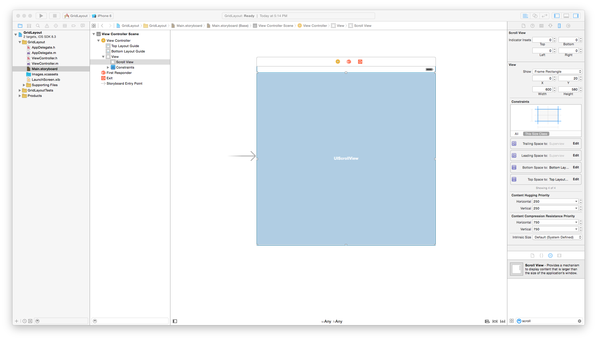
It’s always easy for the scroll view to manage it’s content size if it only has one subview, so add an empty view to it and again, add the top,bottom, left, and right constraints to it.
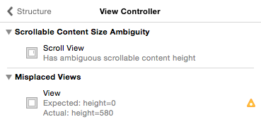
Doing so will create some layout errors, which at this point makes sense since the scroll view cannot infer its content size when the child view has no defined width or height.
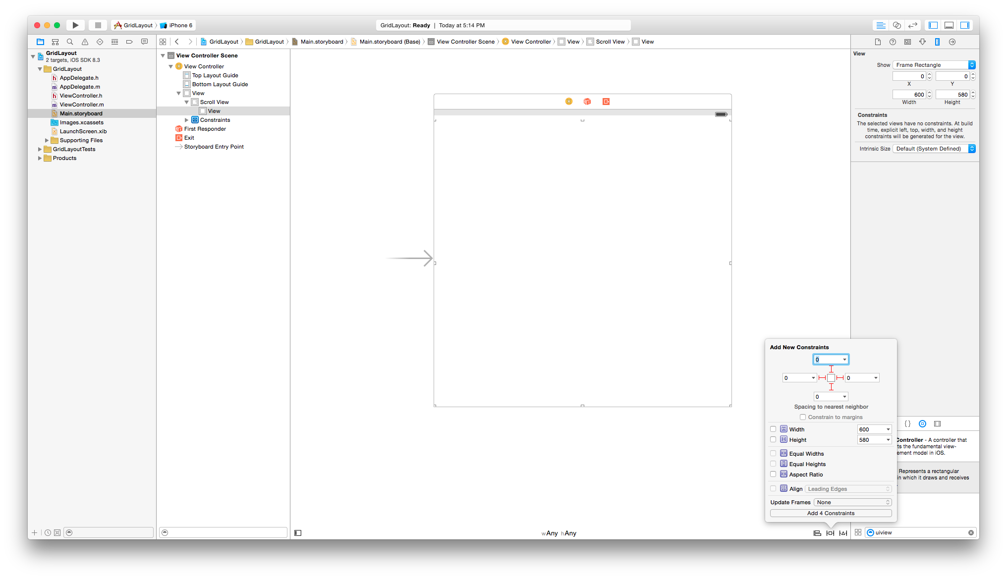
We want a grid with a vertical flow (i.e. top to bottom) where the content width is the screen’s width and the height is dynamically determined by its embedded content. We can set the scrollable content width by setting the scroll view’s child view’s width to be equal to the view controller’s root view’s width (quite the tongue twister I know :P).
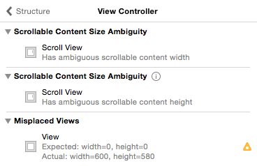
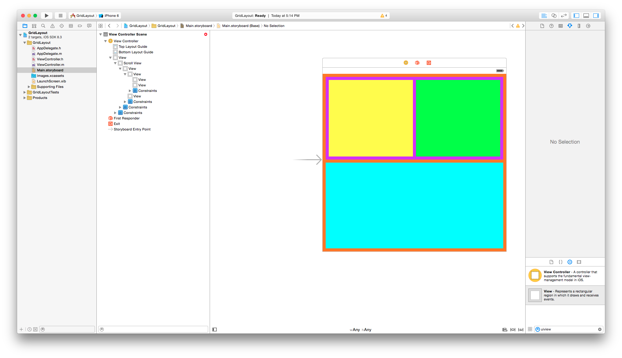
The result should be this:
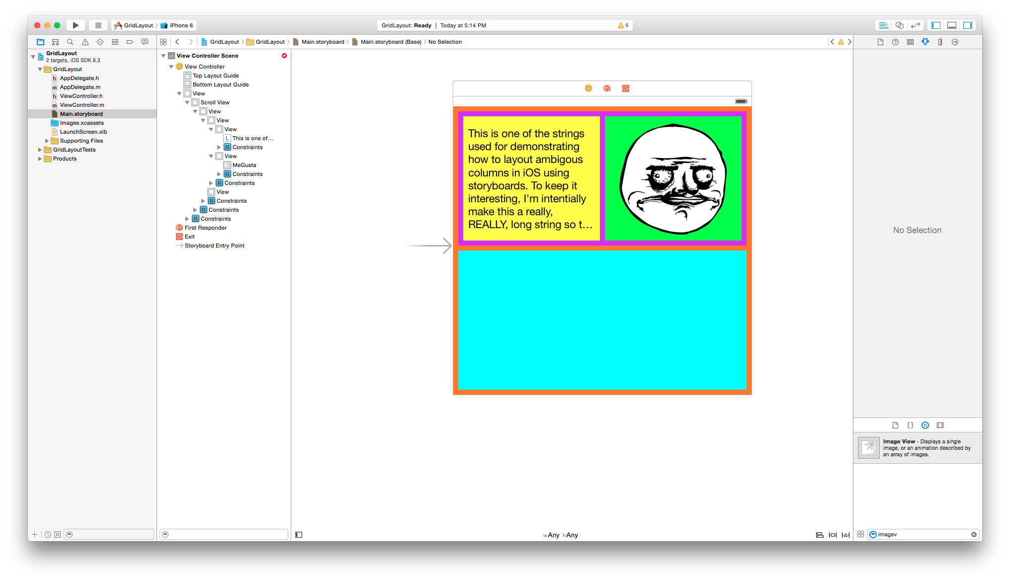
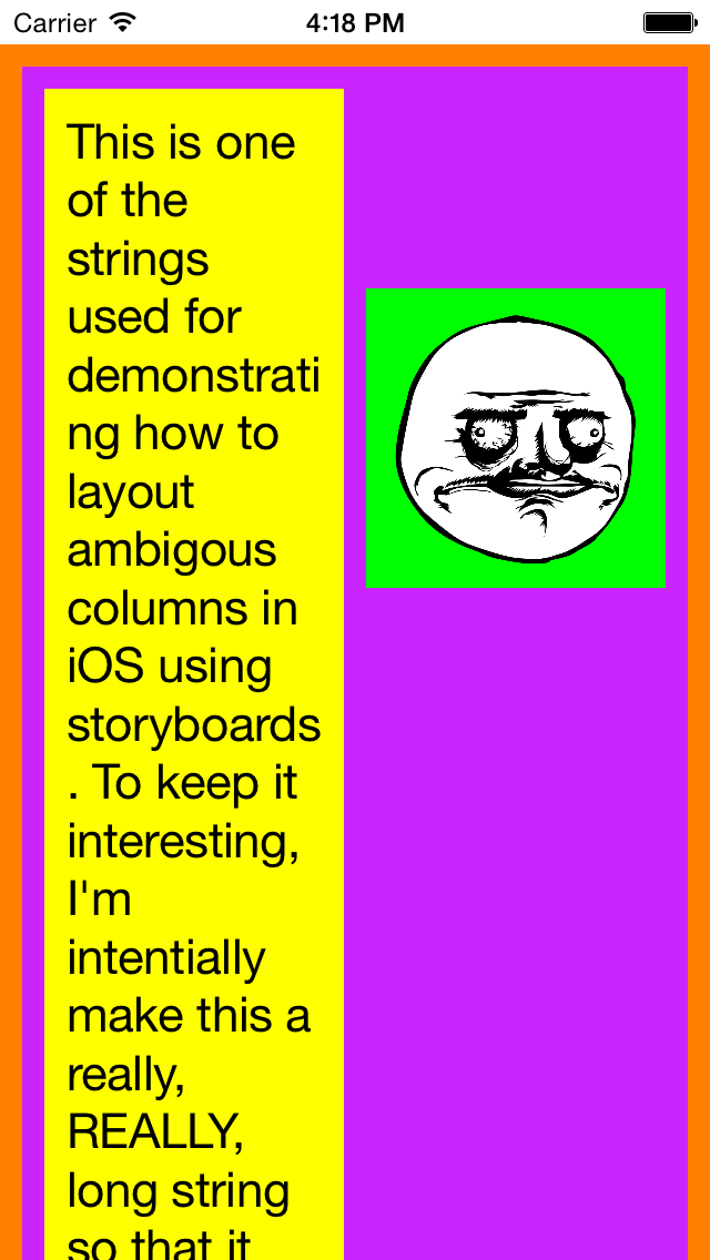
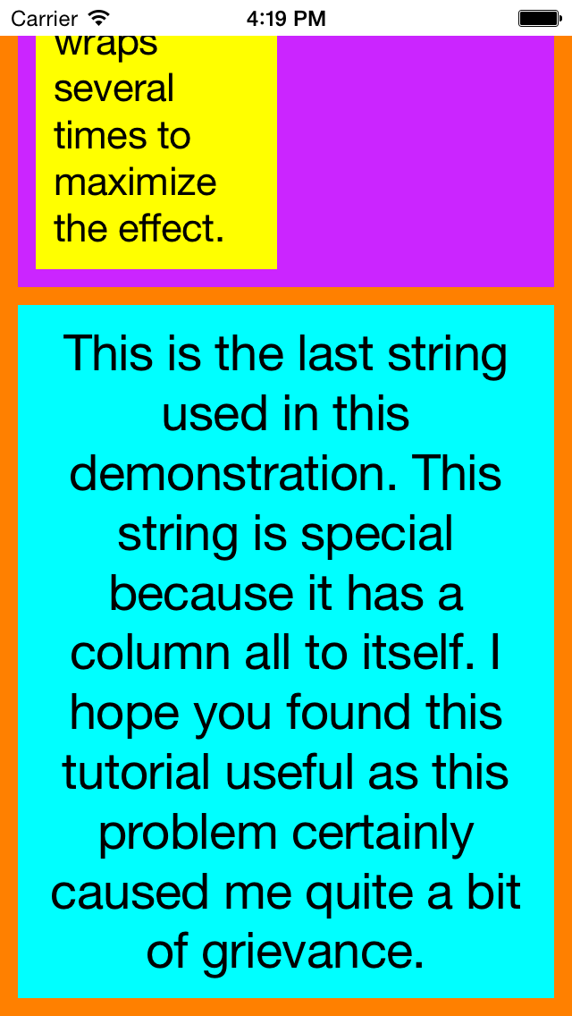
As stated earlier, we are looking to produce a grid with a vertical content flow. To achieve this, we are going to treat each subview of the scroll view’s child view to be the rows, and each subviews of those views as columns (had we gone with a horizontal content flow, it would be the opposite, meaning that the initial views would represent the columns and each children view of those would be the rows). So in this example, the scroll view’s child view will have 2 subviews (the rows), and the first of those subviews will have another 2 subviews in it (the columns). To help us visualize this, I’ve color coordinated the view as following:
Grid – Orange
Row 1 – Purple
Row 1, Column 1 – Yellow
Row 1, Column 2 – Green
Row 2 – Cyan
I’ve spaced out the views and added the constraints so that they all have a padding of 10 to each view. That is, every one of the views have a top, botton, left, and right space constraint of 10.
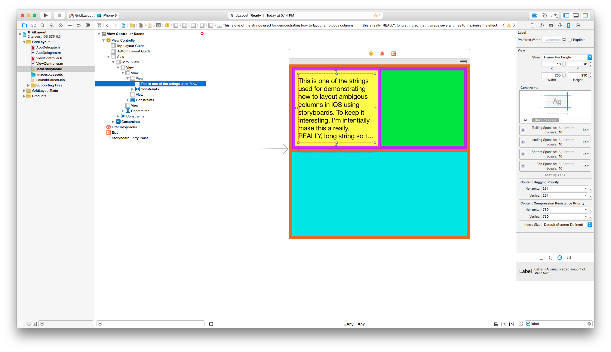
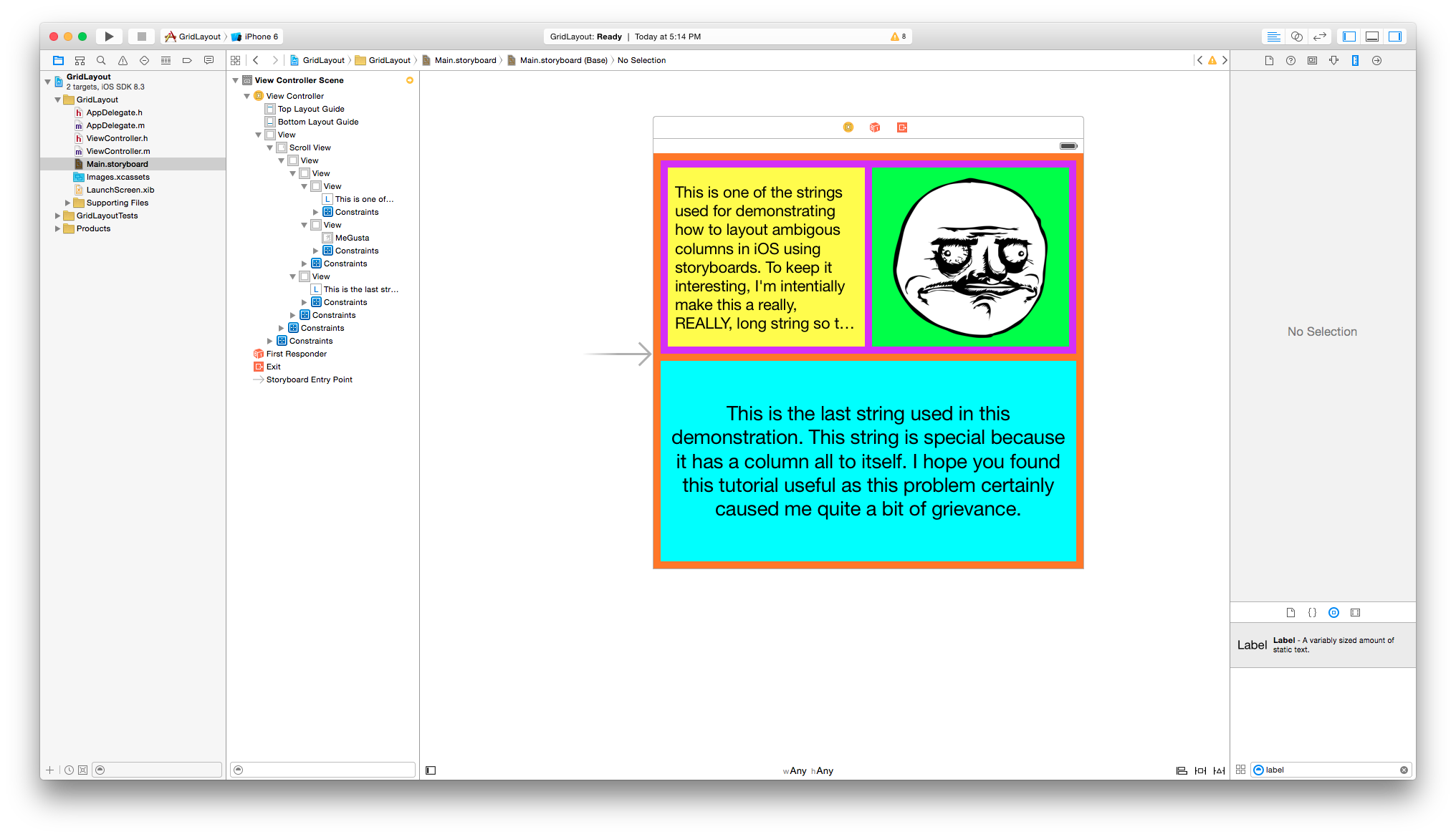
The next step is to add content to the views so their heights, and ultimately the scroll view’s content height, can be defined. For the yellow view, let’s add a label to it.
For the green view, we can add an image view.
And in the final view, we will add another label.
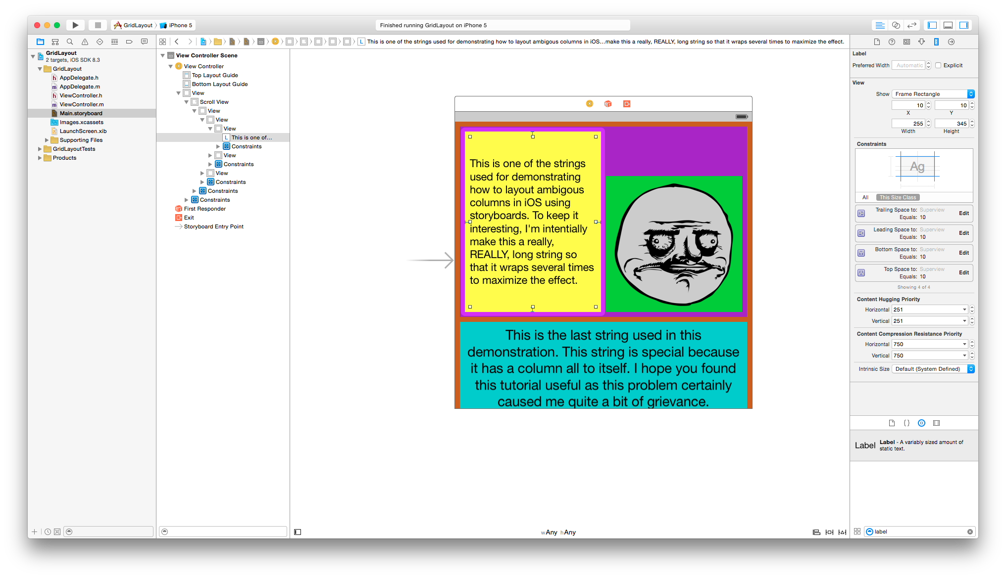
Once all the constraints have been added for the labels and the image view (again, I am using 10 pixels for ‘padding’), you’ll notice now that we no longer have any auto-layout errors (but probably several misplaced views that need to be corrected). However, if you allow Xcode to auto-correct those misplaced views…
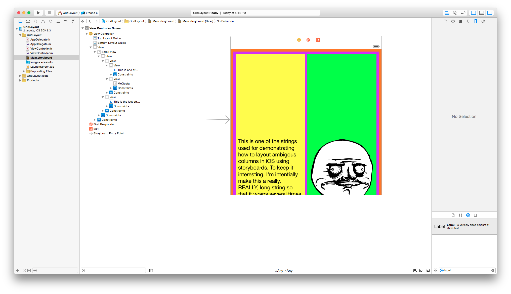
Me gusta! Why hath thou forsaken us? Without defining the constraints of it’s size, the image will use the it’s dimension to determine how it fits in the view. Setting the aspect ratio to 1:1 (or whatever the appropriate aspect ratio should be depending on the image used) is one of the ways to rectify the problem.
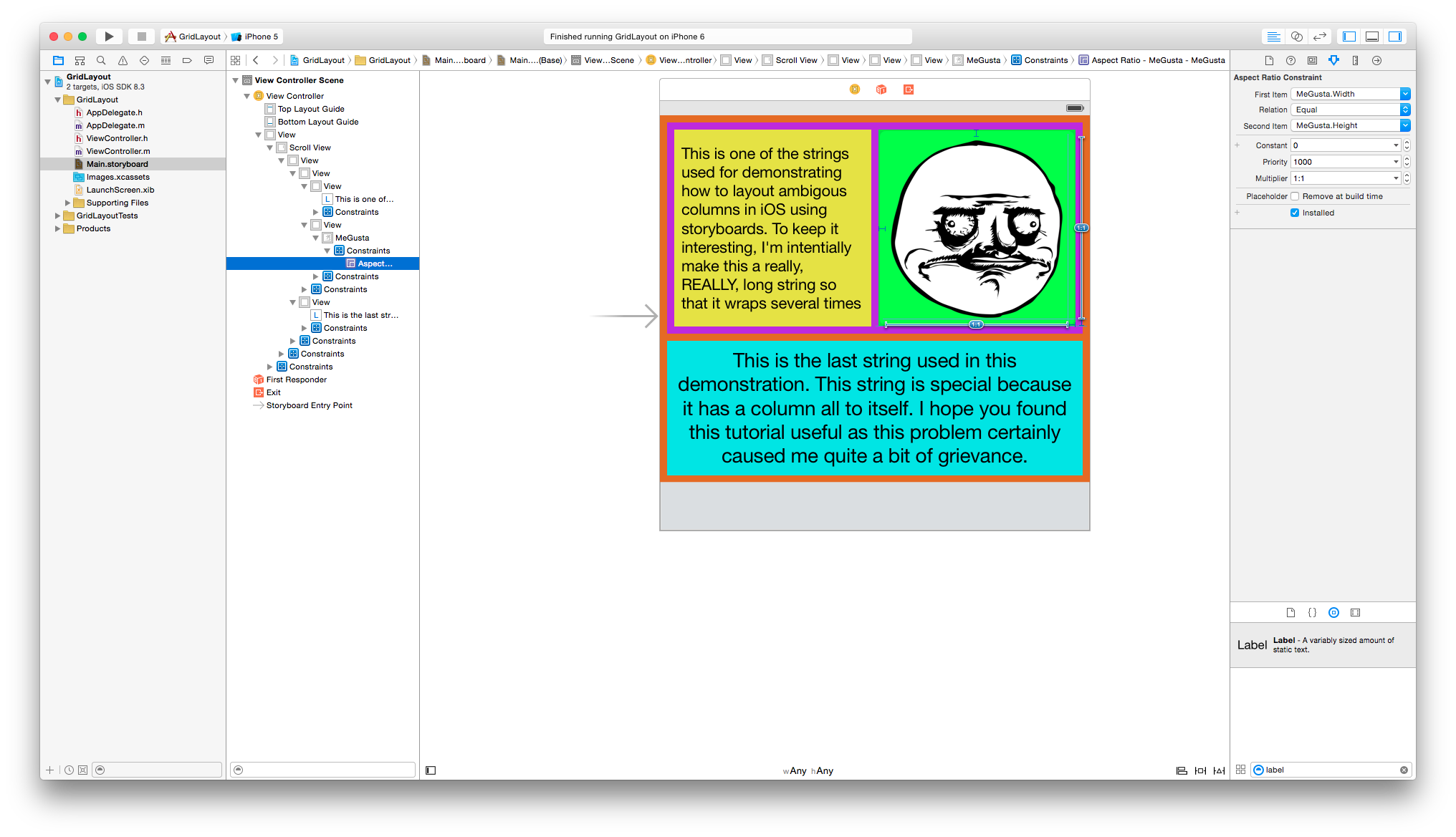
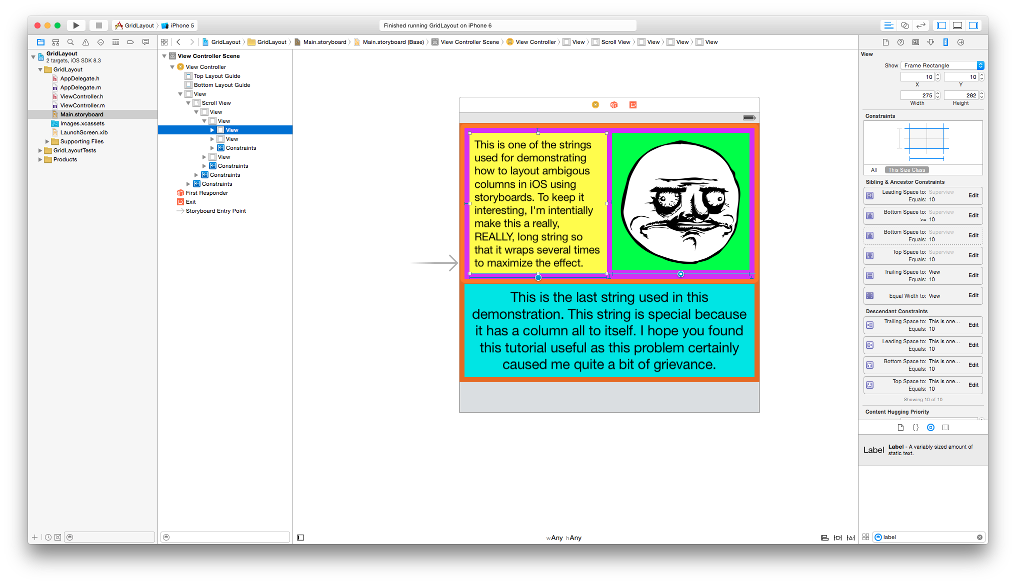
Unfortunately this doesn’t solve everything. If you take a look at the text in row 1 column 1, you’ll notice that part of the text is cut out. The cause is primarily motivated by the natural behavior of labels in iOS, which is to display as much text as it can within the bounds of its property attributes. Therefore, if it is not explicitly provided with defined values for the size (i.e. width = n, height = m), it will infer its size from external influences. Recall that we defined the padding (or more importantly, the bottom constraint for both the label and image parent views) to be 10 and constrained the image to an aspect ratio, we have inadvertently constrained the label’s height to the image view’s height. We can see this be setting the image’s aspect ratio constraint to something where the width is a higher magnitude than the height (e.g. 3:1).
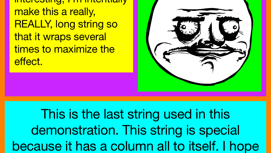
Our ideal vertical grid would have each column scale independently from each other, with each column anchored to the top of it’s row. To accomplish this, we need not 1, but 2 bottom constraints for each column view (or at least if we have more than 1 column in that row). One is to have the bottom constraint be greater than or equal to the desired padding while the second is to have the bottom constraint be equal to the padding (which we already have). The key here is to have the latter constraint have a lower priority than the former. This is equivalent to saying “ideally, I want the bottom spacing to be x, but it absolutely needs to be greater than or equal to x”. This eliminates any constraint ambiguity while simultaneously conforming to all the constraints.
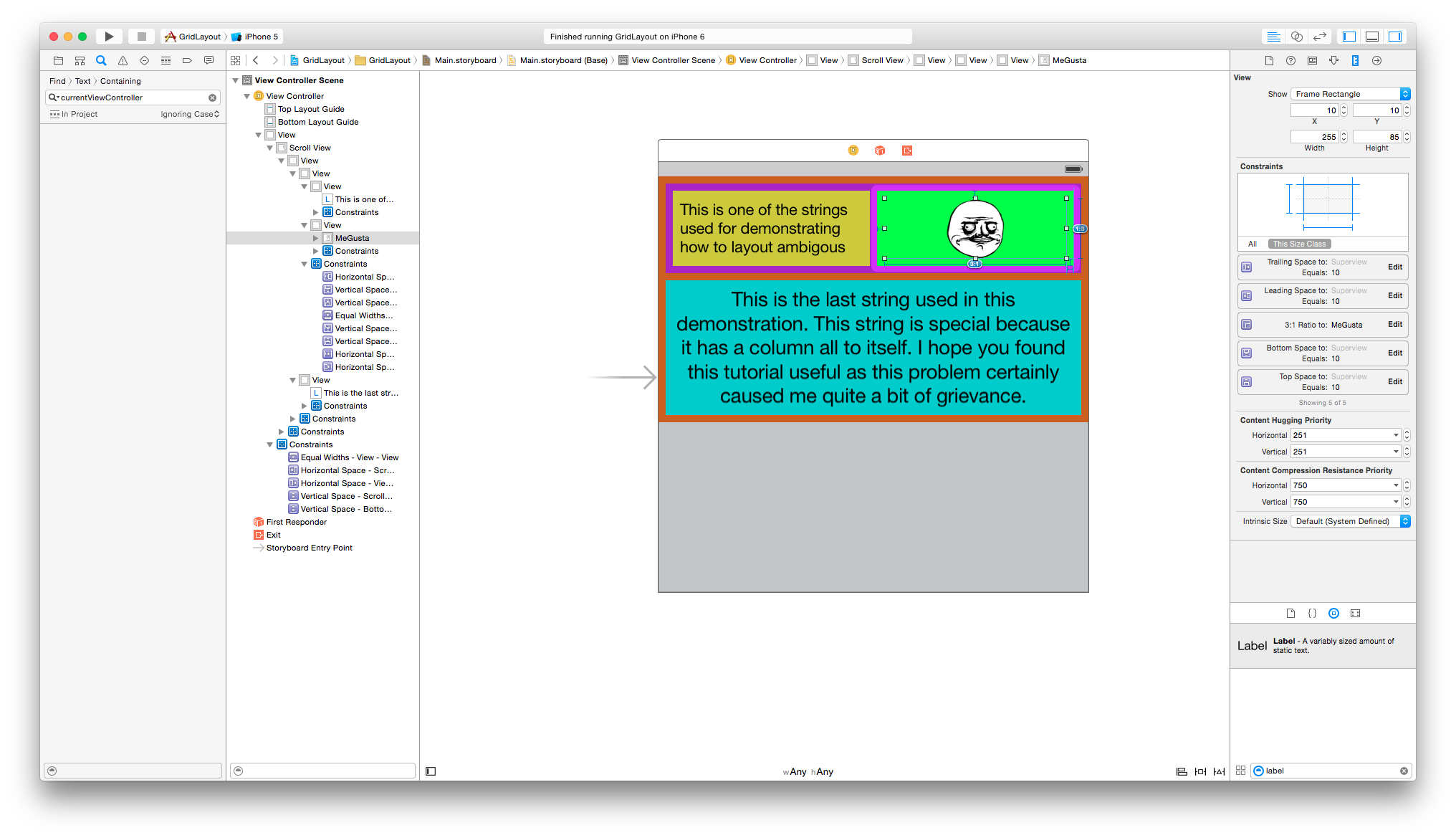
Success! But auto layout enjoys throwing wrenches at us. If we drop the right column view by exaggerating the top spacing to something like 100, we see that the label in the left column will now expand even though it does not need that extra space. The result is the following:
As mentioned before, the content of the label itself will shrink to fit the label but the same can also be said about when the label expands. What we really need is to have the content take precedence when determining the label size. This is where ‘Content Hugging Priority’ and ‘Content Compression Resistance Priority’ come into play.
As the name implies, ‘Content Hugging Priority’ determines whether or not we want the content to expand itself, and ‘Content Compression Resistance Priority’ determines whether or not we want to content to shrink itself, with respect to the UI element’s size. Note that this (or constraint priorities in general) isn’t a scale, but rather evaluates to either yes or no when it is compared to other constraints. Here we want the content of the label to ‘hug’ the UI element, so we must increase it’s vertical content hugging priority. If we want to take the short route, we can set all those values to the maximum (i.e. 1000). The important thing here is that the value of the vertical content hugging priority needs to exceed the priority of the constraint that defines the label’s height. To derive the correct solution however, we need to deduce where the actual problem is. Working backwards, we know that the label’s height is determined by it’s parent’s view height, and that height is correlated to the size and padding of both the label and the image, and ideally we want the bottom padding to be 10 for each column. I’m sure you guessed that it’s the bottom padding constraint that’s causing the label to expand. So for the content to prevent from expanding vertically, we need to set it’s vertical content hugging priority to be greater than the constraint used to anchor it’s parent view to the bottom. In my example, the bottom constraint priority is 750 so I’ll set the label’s vertical content hugging priority to 751.
Voila! The label in the left column will only take up the space it needs, every column expands vertically and anchored to the top (albeit with different top constraint values for the first row in this example), and the second row consumes the width of the screen as though it was just a single column.
Best of all, because we aren’t using numerical values to compute the dimensions, the layout will work independently from the device’s orientation or resolution. So in landscape it will look something like this:
You can view the end result with the attachment provided right below.
P.S. Pardon the typos in the tutorial images :/