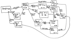
The user interface is the space where interactions between humans and machines occur. The first and most important element is the human, the person that’s using the system and the other people that they work and communicate with. Then you have the target device, that’s the machine that runs the system. Finally you have the interface that represents the system to the user.
At the early design stages of each project, we often don’t know what the problem is or what the space of possibilities might be. Consequently, real-world design is often iterative; they failed fast so designers succeed sooner with more experience. It is important to focus on the people who are going to use your system. “Good design brings people joy: it helps people do things that we care about, and helps us connect people that we care about. Good user interfaces can have a tremendous impact on both [the] individual’s ability to accomplish things, and societies’ ”. (Scott Klemmer) Graphical user interfaces help with computing a hundreds of millions of tasks, enabling us to do things like create documents, share photos and connect with family and find information.
Delivering a perfect pitch for clients needs to have a perfectly-organized and beautifully-designed presentation. Here are three major steps that help designers to present a convincing prototype:
Finding Requirements:
One effective starting point for designing new applications is to clearly identify an existing problem or need. Observing people can also help you build empathy and think from their point of view. Observation helps designers to answer the following critical questions:
1) What do people do now?
2) What’s the baseline that we’re starting from?
3) What values and goals do people have? Most often we want to build interfaces that align with what people care about and what they hope to accomplish.
4) What are similarities and differences that you can find across people?

User observation
(http://www.tadpull.com/)
Storyboarding:
One of the easiest mistakes to make in interface design is to focus on the user interface before you focus on the tasks that the interface is going to support. What is nice about storyboard is in just a few panels you can convey what the user interface will help a person to accomplish. Another thing you can see in good storyboards is that they communicate flow, like comic strips. They are showing what is happening at key points in time. One of the biggest worries about creating storyboards is that interface designers would say, “I cannot draw!” But storyboarding isn’t about beautiful drawings; it’s about communicating ideas, and I think that everyone can learn how to visually communicate ideas. In some ways, bad drawing is actually an asset, because then all you can do is focus on the content.
In general, storyboards should accomplish two things:
1- First, it should accomplish the setting: Who are the people involved? What is the environment? What tasks are users trying to do?
2- It should show the sequence: What are the steps that they do to accomplish the task? — Not necessarily what user interface is exactly, but what role the user interface plays in helping users to get their goal achieved.
Once you’ve got it out on paper, it makes it much easier for people to have common ground, and agree on how to move forward.

Using storyboards for user Interface design
(http://agilemodeling.com)
Prepare a Prototype
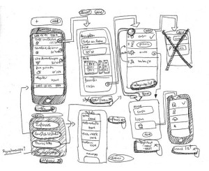
Once you’ve got a rough idea of what your application is going to accomplish, you can begin to plan your implementation. Implementation in this case means “What is it going to look and feel like to the user? What is the actual user interface going to be?” To figure out the user interface at an early stage, the very best technique that I know of is using paper prototyping. Paper prototyping is exactly what it sounds like: You are going to make a mockup of the user interface and instead of doing it on the computer, which can take a lot of time, you are going to use paper to sketch things out really quickly. Paper prototyping is not only fast and efficient; it is also really fun, and you can get really creative in figuring out different ways to convey interactions.

Paper prototype for User Interface design (http://sixrevisions.com)
Conclusion
As your prototypes increase in fidelity — from storyboards, to paper prototypes, to digital mockups — the kinds of evaluation and feedback that you’re going to get from people will be evolved as well. Prototypes can also be useful for critiques within your design team. And as you get to higher and higher fidelity mockups, you can have the opportunity to get to more formal experimentation techniques. Rapid prototyping techniques are probably the most valuable weapon you’ll have in a human-centered design process.

