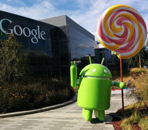
Android Lollipop was first introduced at the Google I/O 2014 event and introduced Google’s new approach in UI design, and Material Design. I am going to call Lollipop “L” for the rest of this blog post for simplicity! Android L has leveraged up the user experience by the order of magnitude. There are a lot of huge improvements and tiny details that provide users with a relatively a new experience. I personally have tried it in my Nexus 4 and am going to share my experience with you.
Material Design
Obviously, I am going to talk about Android’s new interface approach as the first new feature. If I had to describe Material Design in one word, which would be “Animations”! In Android L, everything you touch brings something to the screen or moves it off, so you know exactly where thing are coming from and where the are going. For example clicking on the “Camera” icon, brings the camera app from somewhere, no surprise so far!, but the interesting point is that your eyes are able to follow the transition from nothing to a fully functional camera app. This process happens for almost every single user interaction scenario. I should add that all the animations are playing at a pretty high frame rate even in my old Nexus 4, which almost two years old phone. In general, it seems that Google is changing the graphic design of all of its products. This evolution gives them a 2D-appearance rather than the old 3D-look. It is much more likely to have multiple 2D surfaces on top of each other. Each layer can smoothly and separately move without affecting other layers. This change leverages up the simplicity of the interactions and perhaps reduces the cost of execution, which means more battery. Here is the interesting point! “Everything starts from your finger tip.” The very moment you touch a view, it seems that everything starts moving and spreading from your touch point and you feel that it is up to you to control everything.
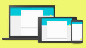
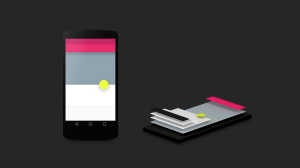
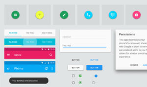
Google also has also changed the color themes and the size of white spaces inside the interfaces. This new look is a bit less disruptive and colors are more solid and not too blended together. Every view clearly defines its boarders and it is easy to separate out views from each other in a glance. Icons are a little bit bigger and shadows are sensible, which helps users understand the order of the layers k\in different views quickly.
Notification Bar
Although notifications have all the same functionalities as before, some extra details have been added to it that makes it more useful. For example, if you swipe your finger down from the top of the screens, you will see all the notifications. If you swipe it down again, Android shows you the quick settings menu. I don’t know if this is something that Google has found through research or something else, but it looks like it has been a correct decision. It means they probably know you don’t want to see your quick settings every time you swipe your finger down from the notification bar area. However, they have put something more important there for you, all of your important notifications, so why waste the space by showing non-important content.
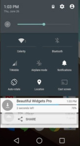
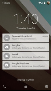
Google also has added some handy features to the notification panel, flash light and screen orientation lock buttons, features that must have been added here while ago! Anyway we appreciate any progress in this regard. Also if you have Chrome Cast, it provides you a new little cast icon in this area, so casting your device’s screen to you favorite TV is just one touch away. Finally, now it is possible to review all the notifications from the lock screen and when the phone is locked. In this screen, swiping a notification removes it from the list of notifications and double tapping on each one opens the related application that the notification belongs to, or you have manually assigned it to that notification. The tricky secret here is that if you don’t know which application is going to take the responsibility of a notification, you always can hold down the notification and Android shows you more content about that notification followed by the name of the application that is going to handle it.
Multiple Profiles
Finally Android L lets users have multiple profiles in their devices. You can simply add a new profile by pressing the profile switcher icon from the quick settings menu, or the settings menu. By doing that you can have multiple profiles, that all are signed in, and can switch between them whenever you want. Also you can create a guest profile that acts more like the “factory reset” button and creates a new fresh profile without any applications installed.
To be continued….
Android L provides many new features and it is too hard to cover all of them in one blog post! In the next blog post I will talk about some other features. We want to gradually cover most of the new features in Android L and then talk about technical aspects of the newly arrived components to the Android ecosystem such as Material Themes, RecyclerView, CardView and etc.

