You may have heard the term “content is king” before. What exactly does it mean, and does it have any relevance when it comes to mobile applications?
The concept has a simple application to mobile design. Users want to see the application content, they care about little else. I’ve gathered some screenshots of Apple designed iOS 7 applications (a version of these applications are included on any iPhone you buy). You could say that these applications are the heart and soul of an iPhone; they make up the primary user experience most iPhone users will have. Let’s carefully consider how some of these applications present their content to the user in a quick and effective way.
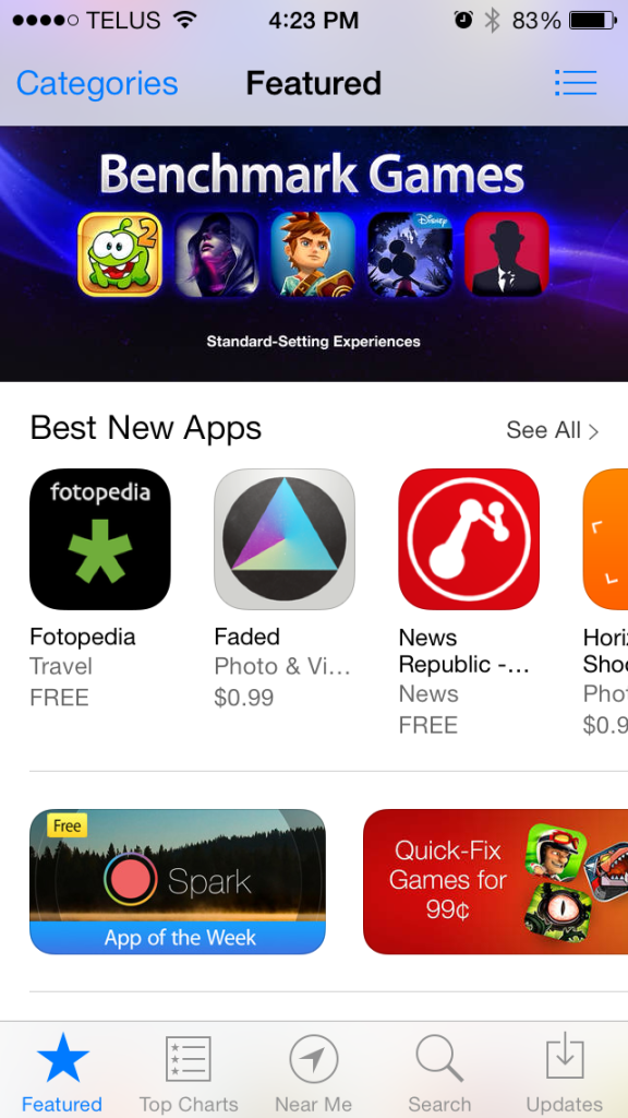
The “App Store”, “Clock”, and “Photos” applications all immediately show valuable content as soon as the application is opened. One mistake that is easy to make is to first present the user with a method of filtering or sorting through data. The “App Store” for example, doesn’t show a list of categories as its home screen. The categories are easily accessible and can be found in one click, but Apple is telling the user that they think the applications they’re featuring are more interesting and more deserving of the home screen space. This immediately presents the user with a visually appealing list of applications and banner ads.
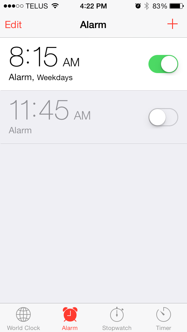
The “Clock” application is similarly made up of 4 tabs, or 4 content pages. The first thing the user is presented with is the content that corresponds to the selected tab. The application remembers the last tab the user had open the last time they used the application. That tab is open by default, the next time the application is run. In this way they have the best chance of identifying what data the user cares about, and opening that data by default. For myself, the “Alarm” tab is almost the only tab I use in the application, and I am immediately presented with my alarms when I open the application. They’ve even went as far as to include the alarm toggles in the default “Alarm” view, thus saving me more time on one of the most common alarm clock functions (turning an alarm on or off).
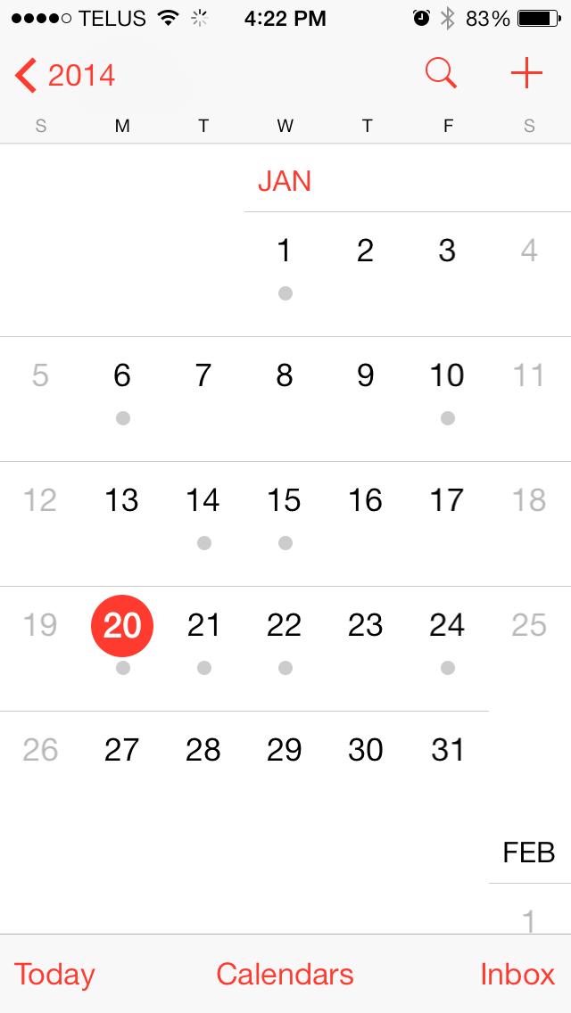 The “Calendar” application takes an interesting approach. When you enter the calendar application you are presented with a detail view of the month that it currently is. If the month is January, the application will show you the calendar for January. In the top left you will see a back arrow that will show you all 12 months of the year. This concept is interesting because Apple has chosen not to show the top level of their application, but to automatically show you one of their application’s details pages because they feel that information will be more useful to you. Showing the detail view, by default, in this push-down navigation application, is an interesting and fairly unique design approach. By choosing to do this the calendar application has forgone having “Month” and “Year” tabs, thus opening up the bottom strip of t he application for action buttons.
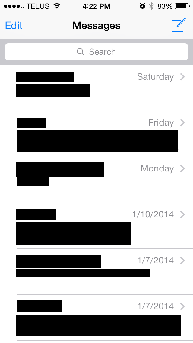
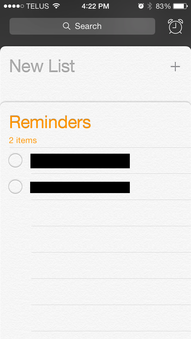
Next I’d like to talk about the applications that immediately present the user with a list of data, but have no tabs; namely the “Messages”, “Reminders”, “Stocks”, and “Settings” applications (pictured below). Apple has identified the primary use cases of these applications, and found a way to, without clutter, present this data to the user immediately. A list of data is almost always the first thing that should be shown when a user opens your application. The fact that the user can see and interact with your content immediately is critical to providing the best user experience. Users do not want to navigate through menus and explore different functions of the application as their first experience with your application. It is almost always a better idea to show the user content related to the part or feature of the application that you think will be the most popular (ideally you’ll have analytics to back up what your most popular feature is). From this feature the user should be able to find or navigate to other features easily (possibly with one of the two navigation methods we’ve explored: tabs or the back button).
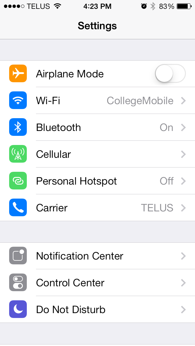
 Any keen reader may note that Apple has broken the paradigm I’ve been talking about on one of the applications I mentioned above. The “Settings” application is the exception. The screen you are presented with could be interpreted two ways, either as a list of content or as an application menu (the menu for the settings app). In this case it appears there was simply no easy way for the sheer amount of settings that the application shows to be intuitively organized into tabs, or given any other intuitive navigation method. In an attempt to mitigate this failure of design the top settings that are shown are meant to be the most commonly used settings. Some of these top settings even hint at detailed information before the user has clicked into the option (the airplane mode function even allows you to toggle it on and off from the root of the settings application). They’ve tried to mitigate the shortcoming of showing the long list of items on the “Settings” apps home screen with this added functionality built right into the menu.
I’ve briefly mentioned some of the ways Apple helps build fast and intuitive user experiences for their applications. The two methods we’ve explored are: starting on a detail page of a push-down navigation application, as well as using tabs to organize and display information (while displaying one of the tabs by default). The same or similar approaches can be taken on the Android platform. Although tabs are currently out of style on Android, a similar concept is often used to organize content. It’s known as a Navigation Drawer. The same method of showing a push-down navigation detail page, by default, does translate directly to Android.
You can see in Android’s “App Structure” documentation, one of the first concepts they mention is “Put content forward”, explaining that, “Many apps focus on the content display. Avoid navigation-only screens and instead let people get to the meat of your app right away by making content the centerpiece of your start screen.” Apple’s documentation similarly describes this concept as such, “As much as possible, avoid displaying a splash screen or other startup experience. It’s best when users can begin using your app immediately.” If you follow the previously provided link you can observe an example of two home screen designs for the calculator application, one that Apple considers bad, and the other they consider good. Here’s a few other relevant and important points Apple’s design documentation mentions:
1) “Avoid asking people to supply setup information”
2) “Make it easy to focus on the main task by elevating important content or functionality”
3) “Use a tab bar to display several peer categories of content or functionality. A tab bar is a good way to support a flat information architecture and its persistence lets people switch between categories regardless of their current location.”
These application designs, as well as the documentation and quotes I’ve supplied, include concepts you should consider when building and designing your application and user experience. Ultimately your application users will care about your content more than anything else, your job is to provide an application to them that makes your content as easy to find and consume as possible. This will result in happier and more engaged users, as well as a more positively reviewed application.
