A smartphone in every pocket, a tablet in every hand and a PC on every desk. That’s the dream espoused by the technologically elite: Computing that is pervasive and all-encompassing. We are well on our way down that path. Smartphone sales surpassed 1 billion units in 2013* and tablet sales reached 76 million** . The people that have bought tablets and smartphones had to be convinced of the value of those devices. That’s where the user experience comes into play.
The user experience of a particular device is defined by a person’s interactions with that device. Today, the interactions that a person has with a particular device are defined mostly by software. I’d like to go over 2 of the most notable differences in a modern computing device versus older computing devices from just a few years ago.
Apps
We’ve always had applications; software that we bought and ran on our computers. We bought them from a retail store, they came on a disc and a major new version would come out every 2 or 3 years. Those were applications. Today we have apps.
Apps are purchased from an online store. This online store is often seen as the definitive marketplace for apps for the device. Almost anyone can submit apps to these stores and be on a marketplace selling to hundreds of millions or even billions of people. 6 or 7 years ago, a developer’s only option if they wanted to sell to the largest number of people would be to sell their software through a physical retailer. Physical retailers have very limited shelf space. They are likely not interested in an application from a little known company run by fewer than 15 people. But the App Store is non-discriminating. Shelf space is unlimited and with so many visitors the demand for apps is monumental.
Apps themselves are quite different from the applications of 5 or 6 years ago. Apps are highly focused, often performing a single task or a closely related set of tasks. Apps are meticulously designed, the developers ensuring that the user is never lost. Older applications prioritized breadth of features and had complex designs to accommodate them.
App updates are quite different as well. The host operating system is now responsible for updating apps. All updates are visible via a single list, each update accompanied by a list of changes (known as release notes). With a single tap, the user can update all their apps. Today, users don’t even need to tap a button: The host operating system will automatically update apps for users in the background. This ensures that every user gets the same experience and is able to make use of the latest features. It reduces support costs for the developer and increases user satisfaction.
Consistency
Software is a playground for developers. We are able to do almost anything in software. That’s very apparent in the variety of apps available across the various app stores. But with software design, restraint is key. Us developers, being the technically minded people we are, can often forget that the users of our software are not attuned to its subtleties. One need only look at today’s version of Word or Excel to be reminded of that. Furthermore, features are laid out differently across applications from different companies.
In the early days of the Mac, software consistency was considered a paramount feature. That a user could learn one piece of software and that that learning would carry over to all the other software is a beautiful idea. Sadly, it is one that lost its way on the desktop. But with mobile, we have a chance to get it right.
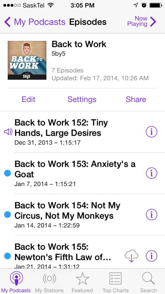
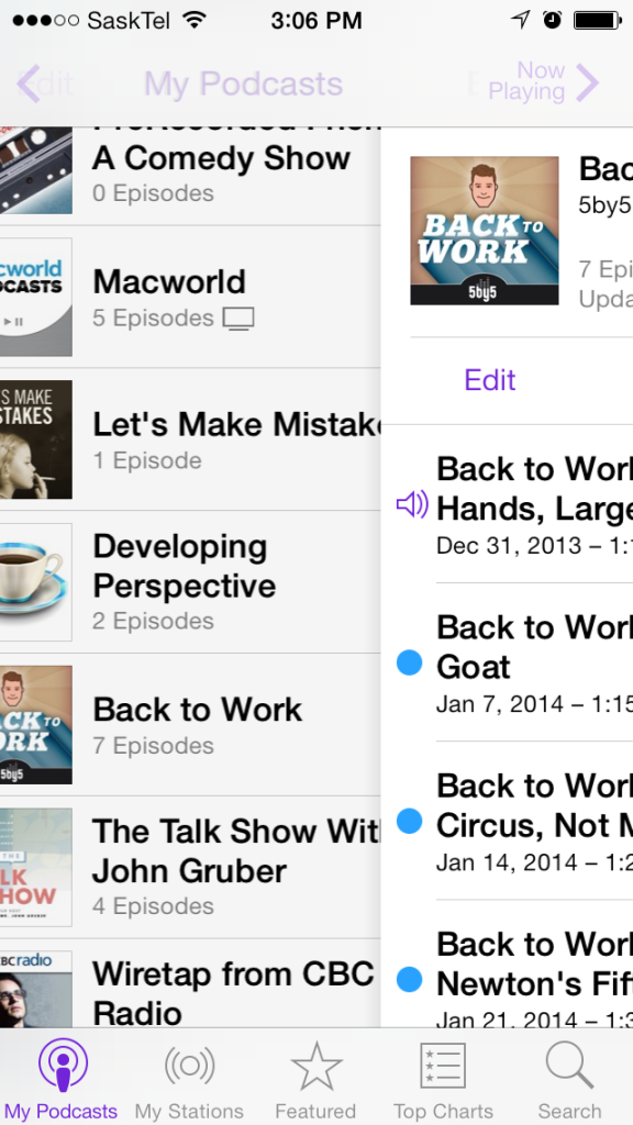
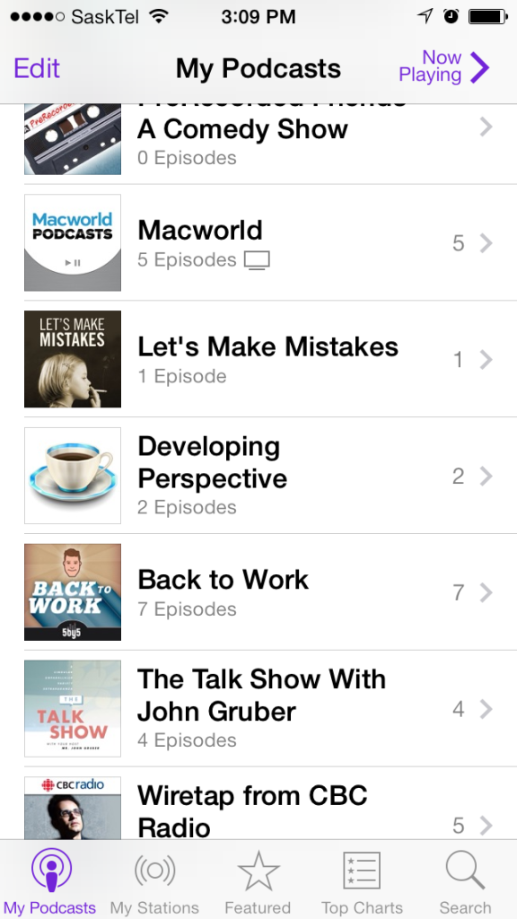
Modern apps have been much better at guiding the user without resorting to handholding. By creating a design whereby the user imagines a consistent mental model of the software, they can easily navigate the user interface. For example, the back button in the top left corner of the screen in an iOS app indicates that the user has something to go back to. The title of the back button states the screen that the user would go back to were they to tap it. When the user taps the back button, an animation occurs: The title of the back button moves to the right and becomes the title of the screen that the user is going back to. This is accompanied by another animation where the content of the screen animates and fades to the right while the screen the user is going back to animates and fades in from the left. See the screenshots below.


More important than the specific design itself is that it is used consistently throughout almost all of mobile software. The designs themselves trace back to the operating system vendor (Apple, Google, Microsoft, etc…) and are heavily encouraged by them. There is also a lot of experimentation within these design patterns.
System Requirements
Do you remember this?
For most, system requirements were an arcane list of ingredients that a customer had to verify. If they did not, the software that they just paid for was useless. System requirements come from a time when what was in a computer was more emphasized than what a person could do with it. A user needed to know their computer’s processor speed, amount of RAM (Random Access Memory), graphics card and other highly technical specifications. Today, all a user needs to do to check that an app works on their device is to try to download it. If their device is not supported, they won’t be allowed to download the app.
What is in a modern device is of no concern to users. They are not aware of their phone or tablet’s processor speed, RAM or graphics capabilities. The App Store lists all the applications available to them and will not let them download any that they can not use.
The death of the system requirement has gone mostly unnoticed (good thing, they were terrible and didn’t need any more attention), but it’s probably my favourite feature of the modern user experience. System requirements required the user to be ripped out of their domain to deal with the technology itself. Anytime that happens, it is a failure of the technology itself.
These are only 3 examples of how the modern user experience is different from the old. There are plenty more: The significant increase in online services, the ability to share data wirelessly, the ubiquity of Bluetooth. Just as modern computing today is not the same as modern computing from 6 years ago, modern computing 6 years from now will not be the same as it is now. But, the lessons we learn in making computing better are largely additive. Most of what we do to make computing better today will help form the foundation for making computing better tomorrow.
Kumaran Vijayan is a longtime iOS and Mac developer. His work at Push Interactions involves making very nice iOS and Android apps.
Article Sources
* http://www.theguardian.com/technology/2014/jan/29/smartphone-sales-billion-2013-samsung-apple-china

