
In this blog post I want to briefly talk about the principles of designing icons for a mobile application.
Before delving into the topic, we need focus more on the definition of an “icon”. Icons are things that let users interact with a user interface. An icon is a visual representation of something, which is easily recognizable and is represented in a clickable format. A single icon should be able to stand on its own. Each icon should have its own purpose and should tell its own story. The key to a great icon lies into two basic properties: 1- Simplicity and 2- the ability to be easily recognizable. Take a look at the following icon for example: As you can see this is a very basic icon made of simple shapes and polygons. However, because of the way it is represented the story behind it is very effective. This icon is represented as a password icon in Apple’s Mac OS and because a password is usually present for the purpose of security, they have chosen the lock icon for it. The icon is instantly recognizable for the users as a lock. As another example, take a look at the following icon. This one looks simple and is made of simple lines and curves, yet it’s easily recognizable by users as a location icon. Also the background of the icon can be changed based on the rest of the application’s interface without damaging the concept that the icon aims to represent.

Icons don’t have to be alone. They can be represented as a set. An icon set is a group of icons that share a similar theme and style. Take a look at the following icon set.
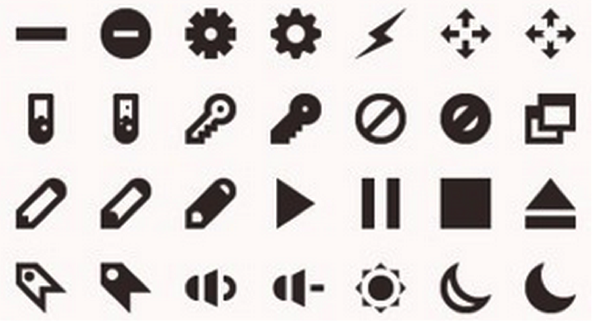
All the icons in this set share a monochromic color scheme. They all have similar lines, curves and style. Of course, any of these icons can be represented on its own, but this set forms an underlying ground for a complete user interface of a mobile application or even a website. So what is the key to have a great icon set? The answer to this important question is very simple: consistency. We want the icons to look like they have been taken from the same origin. The concept of consistency might look easy at first, however designing a consistent icon set demands prominent design skill. Take a look at the following example:
As you can see not all the icons seem to come from a similar source. They have different curvature patterns and lighting. On the other hand, the following icon set has established a very consistent style and format through all the icons.
The style used in icons is something that is dictated by the rest of the user interface, which should be consistent with the context of the application. So what is the process to create a successful set of icons? I personally prefer this three step process:
Research
The first step to designing an icon is research. When we are doing research, we need to look for common symbols for various tasks. For example what do a “Play” or “Pause” button look like? What is the most common symbol for opening or closing a file? As we search through these common symbols, make notes on why you select an icon or why you like a specific icon.
Planning
When you gathered all the information you need to design your icon set, it is time to plan how you want to represent them. At this time, you need to draw the basic shape of your icons and make them look unique and, most importantly, consistent. Sketching skill comes in very handy at this point. Believe me, nothing works better than sketching your icons out and all you need for it is a pencil, a paper and an eraser.
Development
When you are done with your sketches, it is time to develop your ideas and present them in the digital world. Remember, all the icons should be vector based! It doesn’t matter which application you use to make them, what is important is that you should be able to resize and represent your icons in different sizes. Another important factor to consider at this point is the guidelines of the target platform. For example if you are designing your icons for an Android device you should follow different guidelines than when you are doing it for an iOS device.
Remember, designing icons is a time consuming process. If you spend some time on it, you can make amazing icon sets. All you need to do is to consider your guidelines, focus on consistency and, most importantly, trust your creativity.