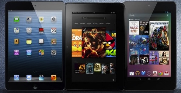
During my presentation at the CANHEIT (Canada Higher Education IT) conference last year, a gentleman asked me something along the lines of, “what about app development for tablets? Do you need to create a new app, or can you just blow up the smartphone version?” I explained how the use case is often different and that the user interface might also look a little different. After the presentation, another gentleman, referring to the earlier comment, said, “you don’t need apps for tablets, you just send users to the website.” Well, it depends! Plus, times have certainly changed since then.
Even for 10” tablets like the iPad 3, Nexus 10, and Samsung Galaxy Note 10.1, an app may be necessary because of hardware usage capabilities (camera, motion, gestures, etc.), advanced user interface options, convenient access, or even caching. An app would also be much more useful for internal tools, such as content management systems or interactive promotional tools. Now, I would argue that the smaller the screen, the more you need a mobile app (and the less you need a website).
Smaller tablets and larger phones (phablets) like the Galaxy Note 8.0 and Fonepad were the buzz at Mobile World Congress 2013, held just a couple weeks ago. 7” screens like the Nexus 7 and 8” screens like the iPad Mini are sure gaining in popularity as they are more affordable and portable than 10″ tablets. If you own a 7″-8″ mobile device, you would likely say that you use mobile apps and regular websites equally. You might prefer mobile apps because most desktop websites aren’t designed for a 7-8” screen and require zooming in on every page (with the exception of responsive design sites). On the other hand, you might prefer websites because smartphone apps are sometimes blurry or have abnormally large text when they are stretched onto a larger screen.
Nonetheless, an app should not imitate content from your website, but instead should provide users with the services they want in the most convenient way possible. Think of banking – credit unions don’t go into detail about all of the products and services they offer, but instead allow their members to simply do mobile banking. Apps for salespeople don’t necessarily describe the company, but instead allow them to simply access CMS systems or provide excellent mobile presentations. Apps for doctors don’t talk about the services they offer, but instead simply help them save lives.
Mid-size mobile devices are unique, so they must be treated as such. Smartphone apps might be too blurry, desktop websites might be too small, and websites might display too much (inconvenient) information. In the end, it’s all about the user’s needs (convenience).
